Steven chats with Kenneth Field,
author of Cartography, about mapping responsibly.
Images discussed in the episode:
Relevant links:
- Mapping coronavirus, responsibly.
- Kenneth's blog.
- Kenneth's UK cheese board, presented at GeomobLON in Septemebr 2018, was featured on the cover of the 2019 GeoHipster calendar.
- Exponential growth and epidemics
- Ten Considerations Before You Create Another Chart About COVID-19
- The power of data graphics and scientific communication.
- 17 (or so) responsible live visualizations about the coronavirus, for you to use.
- Communication themes emerging from coverage of the Coronavirus outbreak.
The Geomob podcast is hosted by Ed Freyfogle, co-founder of OpenCage, and Steven Feldman, of KnowWhere Consulting.
Every week we discuss themes from the geo industry, interview Geomob speakers, and provide regular updates about our own projects.
Popular podcast topics:
Autogenerated Transcript:
Ed 00:01 Welcome to the geomob podcast where we discuss geoinnovation in any and all forms, be it for fun or profit
Steven 00:12 this morning or well, it's morning in California and it's afternoon in London. I've got my old friend, Ken field here with me to talk about mapping responsibly. Tim was one of the first friends that I made when I got into geo back in the 90s he's also the co editor and founder of -inaudible- dot org the website that I run with him and he's the founder of long tattooed a meet up event for the UK data in his community. He describes himself as a self-confessed Carter nerd with a personal and professional passion for mapping. He spent 20 years in UK academia before moving to sunny California to join Esri in 2011 he's presented and published an awful lot. He blogs. He tweets endlessly much more than I do and he's also the past editor of the cartographic journal and the chair of the ICA map commission that you could sum him up as an expert.
Steven 01:16 Mapmaker he's in love with maps. He makes them, he collect them, he writes about them. And more importantly for us today, he's devoted to encouraging others to make good maps and to make maps responsibly. He's the author of a best selling book. Well actually it's a brick of a book. It's a great massive volume entitled, cartography, full stop, which is a compendium of advice for mapmakers. If you want an impressive book to put on the coffee table, this will do the job. If you want a fantastic resource to help you make better maps, this will do more than do the job. And above all, 10 has a lifelong love of Nottingham forest football club, which he continuously reminds me, has won the European cup twice, which is two times more than arsenal have ever won a European competition. So that's my guest for this afternoon, Canfield. So Ken, before we start talking about math being responsibility, tell us what a Carter nerd is.
Kenneth 02:25 Hi Steven. I think you've said it all, haven't you? There's no, there's nothing else to say. He sounds like a really boring guy that I, uh, thanks for having me on the podcast. That's great. Um, I've listened to some of them so far and it's really good fun. So I'm in, I'm interested to know where this, this 30 minutes heads. Let's see where it goes. What does the cartoon it? It is a stupid little moniker that I invented about 10 years ago to describe what I do because you know, people think of me as a cartographer, but I've never actually had a job title called cartographer. I've been a university, I've been a researcher. I am, my official job title here at Ezra is principal cartographic software engineer. While I mean
Steven 03:10 you don't have to engineer software.
Kenneth 03:12 I think of that what you will, but it's, you know, so I just, it's just a bit of silliness really. It was just, you know, something to go with my little cartoon avatar to, I guess you'd call it branding, I suppose, but it's just a bit.
Steven 03:25 Got you into maps in the first, yeah. Was it as a boy scout? Was it when you went, did geography?
Kenneth 03:32 Yeah, I mean I was always, yeah, I always loved the geography classes. My geography teacher, mrs Bursztyn back in Nottingham, you know, you can always remember the names of your great teachers, can't you? And she was terrific and you know, I just, I just love going into the geography class. Just curiously enough, I was quite good at physics as well and my physics teacher wants to be desperately to do something there. And I just said no because I hated boring. And then when I was looking for a degree to do, I just didn't want to do a standard geography degree because you know, there's no such job as geographer really. So I wanted something that I could then translate into a career and eventually I guess side I'd found this course called cartography at Oxford Polytechnic as it was then. And yeah, it was fantastic. I don't, I had a fantastic three years studying cartography alongside geography and then entered the workplace at precisely the point that this thing called GIS came along and killed professional cartography I then,
Steven 04:26 Oh, so you were doing cartography with a pen in those?
Kenneth 04:29 Yeah, I mean I did it. I did. And a lot of the sort of concepts and things we did were pen and drawing and laying down lettering with mechanical type and going into dark rooms and building up maps in that sense. I mean I did do really rudimentary computer cartography on very early Macs and as I was graduating this thing called GIS appeared on the curriculum, which I missed. Um, so I, I sort of fell into that at a research level at a university and then just fell into lecturing really. Um, I did do a work placement some point during my degree at um, British geological survey in Keyworth. I spent six weeks in the, in the drawing room there, and I have to tell you, it was during that experience that I said I would never ever be a cartographer. What a boring job. I thought it was just, it was hideous, you know, it's like literally eight hours a day sitting there with a black pen and drawing a line of consistent width. And then at 10 30, it was 30 minutes of coffee break and the radio went on and the whole drawing office put their pens down. And did that, and it was just so regimented and tedious and I hated it. But they also had an -inaudible- station and I enjoyed that. That was fun.
Steven 05:41 So when I first started in geo, which was in about 1998 you know, it was a second career for me and I was helping out a guy called Mike Klein who ran business called GDC in London, which you probably can remember vaguely. And I went there in between jobs. I went there to help him out for a few weeks and I came home, I don't know, at the end of the first week, collapsed on the sofa and said to Donna, there's no way I can stay here for, I'm going to last more than the few weeks that we've arranged. I can't imagine how I could do this. Right. Sure enough, four years later I was helping a management buy out. The company sold it, you know, and everything started from there. But yeah, it's strange how you look at a job and the first few weeks and you think, I can't possibly do this. And then you discover that actually it's like everything almost. There's a lot of fun once you get into it. So what do you do now, Ezra? You know, you said your what? Chief Carter graphic software engineer?
Kenneth 06:49 No, I don't put the two there. There is an, our job title is a generic, so I'm a principal cartographic software engineer. What does that equal exactly? I what does it mean? Um, so I refuse to have business cards with that on it because if you hand that out, you have a five minute conversation about what the heck that job title is rather than, you know, having a conversation. So what do I do? I work on the team or one of the teams that responsible for developing art gyres pro our desktop software. And I'm on the map offering sort of sub-team there. You know, we are maybe on a 25 people on this team and we're a mix of product engineers who are the people who help design the software, you know, it's functionality, it needs what people want from it and developers who then obviously go off and program and implement it.
Kenneth 07:39 So part of my job is making maps to support testing and design and delivery of the software. But I also have a really open remit. I'm extremely fortunate that they let me do all sorts of other stuff like, you know, writing the book or books as it is going to be going in and going out into the world and sort of doing workshops and teaching people and presenting on cartography and um, you know, how to make maps with, with our particular stack. Although, you know, as an ex academic, my, my real motivation is helping people make better maps. No, no matter what they use. Obviously I'd show them one particular way, but you know, there's a multitude of different ways and better mapping is my sort of key job motivation, I guess. Yeah.
Steven 08:20 So you're sort of the person who brings the map makers view to the product design and engineering.
Kenneth 08:28 Uh, one of them. I mean there's a lot of people here, but I mean, I just happened to be a little more visible, I guess because of all the other stuff I do, but are, you know, I worked with some extremely talented colleagues here who, uh, you know, people will possibly never even have heard of, but, you know, they are no less experts in, in mapping and cartography and, um, you know, that's how we're able to, to develop something decent. I think.
Steven 08:52 What a fun job to get paid to her, to live in the sunshine and to get Bay paid for doing what you really enjoy doing.
Kenneth 09:01 It is a seriously tremendous privilege. And, uh, there isn't a day go by when I don't sort of look out the window and go, you know what, I think this is okay. And yeah, you know, in terms of work I very little to complain about. It's, it's a great place to work and it's a great industry to be in. And I actually, I'm delighted I actually made the jump from academia into the commercial sector, which a lot of people have done in GIS over the years. Getting out of the sort of academic,
Steven 09:30 yeah, I like that. That's a good thing. And I think it would be good if there was a little bit more travel in the opposite direction.
Kenneth 09:37 Yeah, well that's the problem. Once you, once you sort of go out of academia and you realize you were bashing your head against brick walls for very little, you know, with all the incessant demands of research, assessment and mirror ocracy administration act, academia is not a not a pleasant place to be in many respects.
Steven 09:55 I suppose my view of academia as as a part time external lecturer at Nottingham is somewhat, you know, Eva's very privileged, you know, you'd rock up, give a few lectures, but on a few workshops you weren't being paid so you weren't being assessed and it was a very pleasant experience. But it's not proper academia. Right?
Kenneth 10:17 No, you get to, to the good bits and enjoyable bits and then they're the bits in some respects. I miss, I mean I really missed working with, you know, really great students, but on the other hand, I still teach, I still write, I get to go to conferences and present. I basically do everything I did as an academic, but I don't have to Mark a whole load of essays and I don't have to sit on endless internal faculty meetings that, you know, they're just talk shops for for no good reasons. So, you know, it is well I think I made the right switch. I enjoy it. I think it's, it's, it's been a very healthy move.
Steven 10:49 You also get to talk quite a lot about mapping responsibly and um, you and I have done talks together in Tanzania on that subject, but, and of course, more recently you wrote that blog posts that ed Trey focal and I spoke about a couple of weeks back on mapping the Corona virus responsibly. Let's start by just asking you to give the background to that post on map in Corona virus. What happened that prompted you to write that long post on mapping responsibly?
Kenneth 11:22 Well, I guess that was about the 28th of February or so. So we're, we're recording this what sort of 11th of March, just for context and you're as is as is my way. I as, as, as, as many people's way, you know, wake up in the morning and your social media starts flirting with you and you see things and you know, a lot, a lot of my feets are to do with maps and data visualizations and do who said this and what all organizations are publishing that. And I started to see, you know, a lot maps and dashboards and graphs being made about the, uh, the COBIT 19 outbreak at just about the time when China was starting to show pretty serious increases in the epidemic. So I saw a lot of these and I saw some pretty awful ones, I have to say, and I'm not gonna pick on anybody, you know, in this particular podcast, but some pretty big news organizations were putting out maps that were less than optimal, should we say.
Kenneth 12:24 I mean, there were other words we could use, but the pro to get bleeped out. And I said, well, what's happening here? You know, these maps are consumed by millions of people and they are misleading people because of all manner of different design choices that were, were either made or, and that's bad. If that was the case or perhaps the people did it, don't really know what they're doing with the data. So, you know, the maps are just coming out because they've poured their data into whatever system they use to help create the maps and publish it. And it really bothers me when, you know, maps and graphics are put out on very, very public facing large media organization, websites and broadcasts and so forth and on. I sit there and look at the map saying, this is not telling people what you think it is. Telling people, you know, these maps are being consumed by people who don't have the where with all to understand how the mapping technique is mediating the message they're seeing. And nor should they, they're busy being experts in everything else. They are experts in, there can't be cartographic experts as well, but it's absolutely incumbent on the people who are making these maps to do so responsibly and to give people effective mechanisms to help answer their basic curiosity and their then needs for information on this case
Steven 13:43 lead. Following on from that, it's a responsibility on all of us who make maps to recognize that the audience that reads those maps doesn't have the cartographic skills and knowledge that we have. So it's not good enough to say, well, the legend says, and they should be able to interpret people, glance at a map and draw an impression from a map and maybe retrospectively read the legend and the notes at the bottom of the map. So you know, it is really important that we, we take account of the lack of map literacy of the audience for these maps.
Kenneth 14:25 Yeah, I mean by basically people believe what they're shown and that they always have been and we can't expect people to unpack all of the issues within the cartography of communicating information. You know, maps are, are rarely wrong, but they all do tell very, very different stories based on how, how they're built and also how they're, how they're read. What is also important is there is some elements of responsibility on the map reader, but it's, it's also important that we don't assume that, you know, so we have to design around it more than anything.
Steven 14:57 So if you had to sum up that post in terms of what are the key messages for a, let's broaden this out from not just talking about Corona virus, but talking about any naps for widespread public consumption in the media. Let's use the maps that we see in the media. What would be your, your key messages for those, those mapmakers
Kenneth 15:23 firstly, not to be, so I guess the term, it may be a bit too strong, but not to be so arrogant that you think you know how to do everything you might and you might not. And if you have any sort of uncertainty, get some advice from other people who do know what they're on about, and collaborate with people and just pass a map in front of somebody's eyes who knows about mapping and say, what do you think? Is there anything that you could tell me that's going to help improve this? I would encourage people to try to understand the numbers rather than just pouring data into, into your favorite mapping tool. Because of course, you know it's the same when you pour data into a spreadsheet, you know it's going to give you some answer when you some columns or you know it, it'll give you some data.
Kenneth 16:07 But what does it mean if you don't know what it is that you're trying to do and you don't understand the data and you don't understand the sort of mechanisms behind the data, which is part of the problem with the COBIT 19 visualizations. You know, we didn't win infectious diseases. Epidemiologists have been dealing with them for decades and decades. They're based on complicated models of spatial diffusion and so on and so forth. Just simply creating a map of ShowMe web cases are, doesn't tell people is there a problem where I live, you know, should I travel to this city? Should I avoid a congregation in this particular area? You know, the, these sensible questions. But they can't be resolved by a simple map of a large aggregated number based on very, very uncertain data. Anyway, we've got different reporting mechanisms. We've got different testing regimes, we've got different, um, rates of exposure and rates of the epidemic in different areas. And so comparisons are almost meaningless at this particular point. And that, and that's the same for any of any map of any sort of data. It's, um, the same basic ideas about cartography. It doesn't matter whether you're mapping, you know, a disease epidemic or um, election data or whatever it might be. This some, you know, basic sense to being very considerate about the numbers that your, your map,
Steven 17:33 I read today that most of the stats that we're getting and that certainly that are being reported in the press are still reporting the total number of reported cases of COVID 19. So they're making, taking no account, the roughly 50% who are now have gone through the illness and the cured.
Kenneth 17:55 Yeah, and this is part of the problem. I mean the spatial epidemiology, epidemiology of infectious diseases is not a simple concept. And you know what some people may not understand is when I was in Northampton university, I've taught medical geography for 10 years. So I did actually have to get into this and my PhD was on health geography as well. And you know, just just looking at total numbers, it doesn't, it doesn't really give us any sensible metric. It's fatality. Mortality rates are massively different in different areas for different age groups, for people with underlying health conditions where we are on a particular epidemic curve is important. The increasing numbers may appear alarming, but we might actually be on the other points of downside of the curve even though numbers appear to be increasing because epidemics follow an exponential growth curve, not an arithmetic curve.
Kenneth 18:47 And in fact, you know what, if, if you map, if you graph things linearly, they look horrendous. But really if you graph them logarithmically, what we want to look for is, is, is where the curve starts flattening off and becomes a logistic curve. And the point at which the curve starts to flatten is called the inflection point. And then we end up, you know, basically in a, in a sort of, uh, the other side of the, the epidemic as we start to see more people recovering, less people getting it, et cetera, et cetera. So yeah. Totals or maps, simple bar charts of today's situation with non-comparable regions. They're there. Yeah, they're misleading.
Steven 19:32 So many, I mean, I know when ed and I were talking about this, we came to the position that we couldn't, we weren't even sure that we should, that maps were helpful. And in explaining what was going on with COBIT,
Kenneth 19:44 I think I would agree. But of course, you know, data is data and people put data on maps. We're not gonna go over that. You know, that's just the way of the world. I would, I would recommend people sit back and question why they're making the map though. I mean, clearly for some it's their job. And it's part of their provision to provide information for others. Maybe, you know, is it public servicing or is it self-servicing are you just trying to show people that you, you can scrape data and make a map? Well that's cool, great, lovely. But these maps are consumed and you know as well as I do that, you know, a lot of maps that don't deserve to go viral, go viral and a lot of maps should go viral and be really, you know, they're the ones that people should go to actually don't. So we can't -inaudible- yeah, I know. And that's okay.
Steven 20:35 I did a talk a couple of years ago on fake maps and some of the mistakes that you could make in making a map. And one of my sort sort of headline raw suggestions that I gave to people was if you make a map and it shows exactly what you were expecting it to show, go make a coffee, come back and have another look at it. Or it may be ask a friend to have a look at it, which is actually what you said right at the beginning. And I think, you know, it's such an important point that we all go into a map making or a data analysis, you know, nevermind where it's a map or a chart, you know, we go into it with some kind of idea of what trend or, or theme we want, we expect to be showing. And when the results come out, how we expect, we think, Oh that's good. And we walk away and we forget that our bias is probably heavily influenced the way we've selected and process the data.
Kenneth 21:42 Well, I mean, this bias in everything we do isn't, and there's bound to be the case. Um, there's bias in how people read the map as well. And uh, frankly I could, I could take a data set and basically make a map to tell whatever story you want it to tell. Just, yeah. So the second book is, you know, it's an election mapping and it's 101 ways to map the same data. And that's the point. You want to make a really partisan map. Of course you can if you wanna make a bipartisan map cause she can. And so it's, it's, it's just important. And I guess going all the way back to that sort of pen and ink stuff that I did in my degree, the one thing that's missing today with people's ability to make maps is that appreciation of time and to take the time to think about what it is you're doing.
Kenneth 22:26 I, and I'm not decrying modern mapping towards it, obviously it's great and it's here and I love the fact that anybody can make a map, but sit back, think about it. Make choices based on intent and good decisions rather than just assuming the software is going to do it for you. Software has to have, defaults, has to, and better defaults are always better and it's best. Partly what we try to do here is make better defaults. So you, you have less opportunity to make a mess, but you can only become a smarter mapmaker if you have a little bit of knowledge and then apply that knowledge. And like I said, if you don't just ask someone, it's, it's not difficult.
Steven 23:06 It will be great if when you started to map data, the software could steer you towards the better ways of mapping the data and avoiding some of the pitfalls. You know, like normalizing your data.
Kenneth 23:24 Yeah, I know. But you know, I mean this isn't a conversation necessarily about archives pro, but you go to, you get, you're gonna make a choropleth map in our software and you know there's first to drop dot drop downs are what is the variable to map and then the next drop down is normalization. So the hint is there, but we can't prevent people from mapping in the other mapping techniques because that's just as valid. And the other thing I would say is, you know, we've done an awful lot of work for instance in once you've made those selections, we give you a subset of all the color choices available, which are more sensible for that. So software does do this to an extent, but it varies amongst different software packages. And,
Steven 24:08 and the truth is that software is not a way of getting round than the, to have expertise, you have to have knowledge. Just because you can use a spreadsheet doesn't make you an accountant, just because you can use the GIS does not make you a map maker.
Kenneth 24:24 No, but I mean you think just how our life has progressed. You know, we all do have spreadsheets on our computers now. So we do do that. Yeah. We all have work processes. So we're all writers now. We all have mapping software so we can make a map. So the proliferation and availability of tools has allowed us to actually, you know, get involved in a much broader of work. I think so. I think so, but it does mean we just have to step back from time to time and think. Uh, and certainly with the books I've written, you know, I can write, but once I've passed it to an editor, Oh, I can see how much better the work is. So that's their expertise. I wouldn't be so stupid to publish a book without putting it through a professional editor. And that's the same with the, I think.
Steven 25:12 Yup. I think you're right. Now I'm going to just, I can't resist cardiograms because I hate grams. You know that. And you ticked me off for my strong views on Kartra brands. And you said, well just because you're contrary and you're my mate, and you said, you said to me roughly words to the effect that a cartogram doesn't need to add anything in terms of information above an ordinary map. And you then told me that a cartogram was just another way of normalizing the data. I disagree strongly.
Kenneth 25:51 Well, you can't have your own fact. I mean the fact the fact is a cartogram is a perfectly reasonable way of mapping data. It is the counter to normalizing the data within a geographic map because you normalize the area to accommodate the differences in area size and population density. So technically there's nothing wrong with it. Now, where I will absolutely back you up and agree with you is that people have a visceral hatred of them if they don't like them. The Marmite of maps, you know, it really is a cartographic. Tata Graham's evoke really visceral responses. Some people love them and some people just hate them. The other thing I'd say is we must be absolutely clear here, we're talking about what's what we know is that the population density, Claus and cartogram, the Gassner Newman one, the one that warps and geography, but that's only one type of -inaudible-. Yeah, but there's plenty of other types of cartogram gridded cardiograms hexagons and binned cardiograms so let's not paint them all with, you know, no bad brush.
Steven 26:58 You're absolutely right. And I certainly, when I, when I was sounding off about Carta grams, I was sounding off about those Gessner, whatever you call it, things those stretched abortions.
Kenneth 27:13 Cool. Well, so part of the problem with those is if you've got a, a massive range in your data sets, which have very high values and a lot of very low values, which for the COVID 19 data is certainly what we're seeing. So that will bulge someplaces massively and it will contract many, many others massively. So it probably leads you to, you know, look at it and go on earth one earth is that,
Steven 27:41 I think more to the point, you know, it leads me to do that and I understand what's going on with that type of Carter,
Kenneth 27:48 well let me say this too, let me say this public. How many carts crumbs have you seen on news media sites? I haven't. So you could go to say that actually people are being responsible and they're not using bizarre makin techniques or letting us know bizarre is the wrong word. Um, they're not using, you know, the slightly more, that's a good way of putting it. You know, people aren't sticking to fairly tried and trusted mechanisms. There's a place for cardiograms and you know, in a very, very fluid emerging situation with a disease epidemic, it's probably not the time to start messing around with experimental cartography, let's say.
Steven 28:31 Okay. That's a good point for us to agree on that. And just move on to a question that I wanted to ask you, which is do you think that free and open software and API APIs and open data have created a problem for us or are they just part of the democratization of cartography?
Kenneth 28:55 Um, I think that's probably a leading question. Um, I don't think it's a blame game. I think proprietary is just as you could, you could throw everything in the mix, you know, people could make maps and what's exacerbated the problem is just over the last 10 or 12 years, an awful lot of people are coming out of computer science programs and finding that maps are built on numbers, whether it's coordinates and coordinates with attributes attached with them and data is published in all over the place. And it's like, well, Oh great, we can do something with this. Now if you were a traditional cartographer or not, I'm not going to name names, but people do have do this. You'd sit back and you'd moan and you'd say, well, who are these upstarts are coming in? And you know, basically doing the work that I'm trying to do.
Kenneth 29:42 Well man, that's just jump on board because that's the way things, you know, you either jump on board and, and rescale or you, Oh, you die as a maker. And you know, I've probably morphed through all sorts of different software and tech throughout, throughout my career. And you just have to, and you have to get on with it. So you change things and you say, well, you know, let me help you rather than just be critical. So as exasperate the problem, if you think of it as a problem, then maybe, but you could think of it as an opportunity as well. There's so many more people getting involved in making, making maps. So we might see a high proportion of, you know, pretty poor maps, but we also seen a pretty good proportion of better maps. And if I look over the last 10 years, those, the ratio of what I see as poor to what is pretty good, he's actually improved dramatically. So, um, that's, that's, that's a great thing I think.
Steven 30:35 Okay. So I agree with you. I absolutely agree with you. I know
Kenneth 30:40 you're agreeing, this is what sort of, what sort of conversation is this?
Steven 30:43 That's a fine conversation, you know, I mean, I agree with you. I mean, I, yeah, I mean particularly because, you know, I come at it from the sort of open source community and I've done a fair amount in the community, you know, and I think it's a great thing. And I think allowing people to experiment with data and to come up with different perspectives and insights on that day tour is incredibly valuable for society in general. It does mean you're going to get people making what we would consider to be elementary errors, but yeah, and
Kenneth 31:18 that's where it -inaudible-
Steven 31:19 to reach out.
Kenneth 31:21 Yeah, that's, that's fine. And that's, that goes back to my point earlier, as long as people are open to others pitching in saying, Hey, there's a problem with this, or there's an issue or I think you can make this slightly better. And they go, you know, their, their response is, Oh, thanks for that. But I know I've had both. I've had both, even in this last couple of weeks, you know, I've worked with a major newspaper editor, visual graphics editor, and I've changed because they've gone, Oh thanks. And I've been in discussions with a major broadcaster and they're intransigent, you know, so you win some you loosen.
Steven 31:55 Yeah. And I think that's just a constant journey that we're going through, you know, educating people, helping people. Yeah.
Kenneth 32:04 If, if everyone made the maps, great, I wouldn't have a job, would that, would I say no, this is career longevity. I've got in mind here.
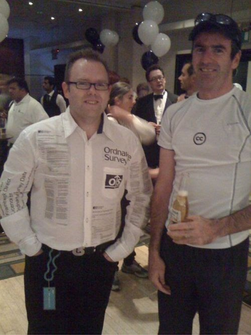
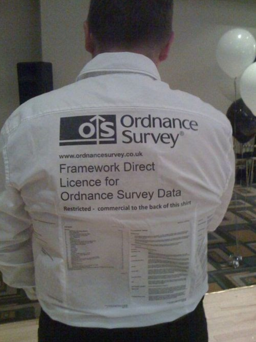
Steven 32:12 So before we wind up, my first memory of meeting you, Ken was a, an AGI party. I mean, I don't know when we're going back to, but we're probably going back to 2000 or 1999 something like that. And you were wearing a white shirt with the ordinance survey map, licensing terms printed on the front and the back and the sleeves of this shirt. What was going on?
Kenneth 32:36 Yeah, this was the late nineties wasn't it? This was, this was the period of Charles Arthur was talking about opening data up and you know, open street map was just sort of starting to bubble I think if I remember rightly. And yeah, there were lots of discussions about government data sets being made publicly available. And of course ordinance survey at that time had a pretty, pretty pretty restrictive license shall we say. And at the time I was working at Kingston university, and this may make it difficult for trying to do GIS with UK data because you know, it was, I actually helped set up some of the Digi map services at the Dean or in, in around about the same time. So if I remember rightly, we used to have fancy dressed and made the geo community sort of, and I'm surprised you remember it. I'm surprised you remember it because as I also recall, it was fairly liberal with the liquid as well.
Kenneth 33:30 It was fairly well with the liquids. So when we were younger so we could consume more. That's true. So I thought I'd, you know, I'm going to, I'm just going to come as a license. And my colleague, good friend and colleague, James O'Brien, who I worked with at Kingston, we decided to come as two sides of the same coin. So I came as an ordnance survey license and he came as a creative commons license. So I just printed, I just got the ordinance survey license and I just printed it on a, onto a shirt in it. Uh, I haven't got the shirt anymore. I think it just basically collapsed after that evening. Uh, and James just printed a very nice small circle with CC in it on the front. He had a much easier job and that was the point. It was like, here are two licenses. One is simple and one is really quite convoluted. And you know, it was a bit of fun. Um, but I do, I do have a picture of it and I believe Jeremy is in the background and the picture in a tuxedo,
Steven 34:23 Jeremy morning is in the background in a taxi. Edo and I think that saying our ads.
Kenneth 34:30 Yeah.
Steven 34:31 And we'll put that fabulous picture of you and James in the show notes at the, when we publish the pod.
Kenneth 34:40 Yeah, it was a while ago. So I've got my hair then.
Steven 34:42 That's true. You have. And if I may say so, it's a slightly slimmer and Spelter 10 field on the one, the cuddly guy that I know now.
Kenneth 34:53 Sorry. Kind of each say cuddly, but you know, sitting on your backside in front of the computer all days. It's not hard one. Yeah.
Steven 35:01 Yeah. So Ken, my closing questions for you. The normal closing question is your favorite moment from a GM up that you've attended?
Kenneth 35:10 Yeah, easy for me because I've been to one, I don't live anywhere near London in the minute. Yeah, no, I have just a couple of years ago I came to, I brought a cheeseboard -inaudible- is a Britain cheeses, a Britain, let's just do something. It was also memorable if I recall for the fact that, um, I made a complete hash of my presentation because I couldn't get my computer decided to basically blue screen it and then someone insisted I had to use a, which if you know me is like I can't do that. It just doesn't work. So I think, I think it was Gary Galey sorted me out with his Mac in the end and we got through it. But yeah, we got through it. I wish I could come to some more, but I'm like maybe I'll make sure I'm around next time isn't it? There's one,
Steven 35:53 well there's going to be one of the, if there is a London mapping week in may, then they might do more during that week.
Kenneth 36:00 Yeah. And we're also planning a longer chewed event that week as well. But obviously stay tuned for that
Steven 36:05 on a different note. So we'll have two opportunities to hang out together and talk about maps. And an extra bonus question for you. We've been running Mappery.org now for 18 months, 20 months if you've got to pick one map in the wild. But we've published which one would it be?
Kenneth 36:24 Right? You're going to hate me for this. I'm not going. No, I'm not. I'm not going to pick them up. I just loved the variety. That's what I pick. Okay. I think it's fantastic. The fact that it's just an obscene number of different circumstances in which maps are seen in the wild. I mean, they can be, that can be on anything and they can, they can, they can look like anything. There may even be a cartogram somewhere in the wild that you look at and smile. You're right. You're right. And that's the beauty of it, right? I think as, I think it's just a bit of fun. It's good.
Steven 36:56 Now I've got a sneaky question I've just got to throw in. Which map do you think has had by a massive, massive margin, the most views on the site since we launched?
Kenneth 37:09 Oh wow. Uh, can I quickly bring up the, uh, the admin page? I don't know. And I don't know. I don't know.
Steven 37:16 It's absolutely gobsmacking tell you. You're telling me we published a picture of an colossal matte, which I said was possibly the world's largest map. And I can't remember where is it somewhere. It's not Romania, I don't think. But if somewhere in central Europe we'll go and look afterwards. But the amazing thing is that because of the way Google index is our side, yeah. If you search for the world's largest mine, Mappery will come up.
Kenneth 37:49 Oh cool. That's good. How many page views is it had?
Steven 37:53 Oh, which is 2000 roughly, which is in the context of the site is massively, most posts get a hundred, hundred and 50 views is a, is a well viewed part because not many people go to the website, they view on Twitter or they get the newsletter. You know, this is just the websites, um, stats, but it's, it's fascinating.
Kenneth 38:16 Can I give you a stats just to finish it with -inaudible-? When I started working at Esri in 2011, my first blog post on the Esri site got more page views in the first week than, uh, all of my academic papers had received in the previous 20 years. And which is incredible. Right. And the recent Corona virus blog that I wrote as of today, as of today, has had quarter of a million page views on our site and the, and the Twitter thread that I put out, which was basically the same content just in tweets. Yeah. Is that 80,000 impressions. So this is what I'm talking about when I talk about reach and then the need to do things responsibly. You know, people are, people consume stuff that they read and see on the internet. So we've got to do it responsibly I think.
Steven 39:09 Absolutely. And that sounds to me like a really good point for us to finish. So just before we go, Ken, tell people who want to follow you and learn a bit more about cartography where they can find you.
Kenneth 39:22 Well if you can stand it, I'm most visible on, on the Twitter thing I can field. And just as an aside, the only reason I'm on Twitter is because of a guy called Steven Feldman. He persuaded me of it's the next greatest thing back in early 2009 so basically I'm on Twitter and it's all Stephen's fault. That's a problem when you were still looking. Yeah. Yeah. You got that. You came to do a a little lecture, didn't you? Yeah, I did, and so that's probably the main thing, but there's all sorts of blogs that I'm involved with and it's not, not difficult to find my email if you want to get in touch.
Steven 39:56 Okay. Ken, it's been a pleasure. Yeah, we completely screwed up on keeping this to 30 minutes. I'm going to get a massive bollocking from ed fray focal for running way over time. Okay, I'll do that. It's been a lot of fun, so I got to say goodbye care. Take care. Bye.
Ed 40:17 Thanks everyone for joining us today and listening to the geomob podcast. Hopefully you've enjoyed the discussion. Please don't hesitate if you have any feedback for us or any suggestions for topics that we should cover in the future. You can get the show notes over on the website, which [email protected] while you're there, if you're not yet on the mailing list, please do get on the mailing list where we once a month send out an email announcing future events, summarizing past events and just generally sharing, uh, events that you may find of interest. You can also of course, follow us on Twitter where our handle is geomob. You can follow Steven at Steven Feldman. You can follow me freyfogle you can check out Mappery at mappery dot org and of course, if you need any geocoding, please check out my service, which is open cage data.com. We look forward to you joining us again at a future episode or end of course seeing you at a future geomob event. Hope to see you there soon. Bye.